Bastion
Brand revamp for APAC crypto investment firm. Brand story driven design, neat yet sophisticated.
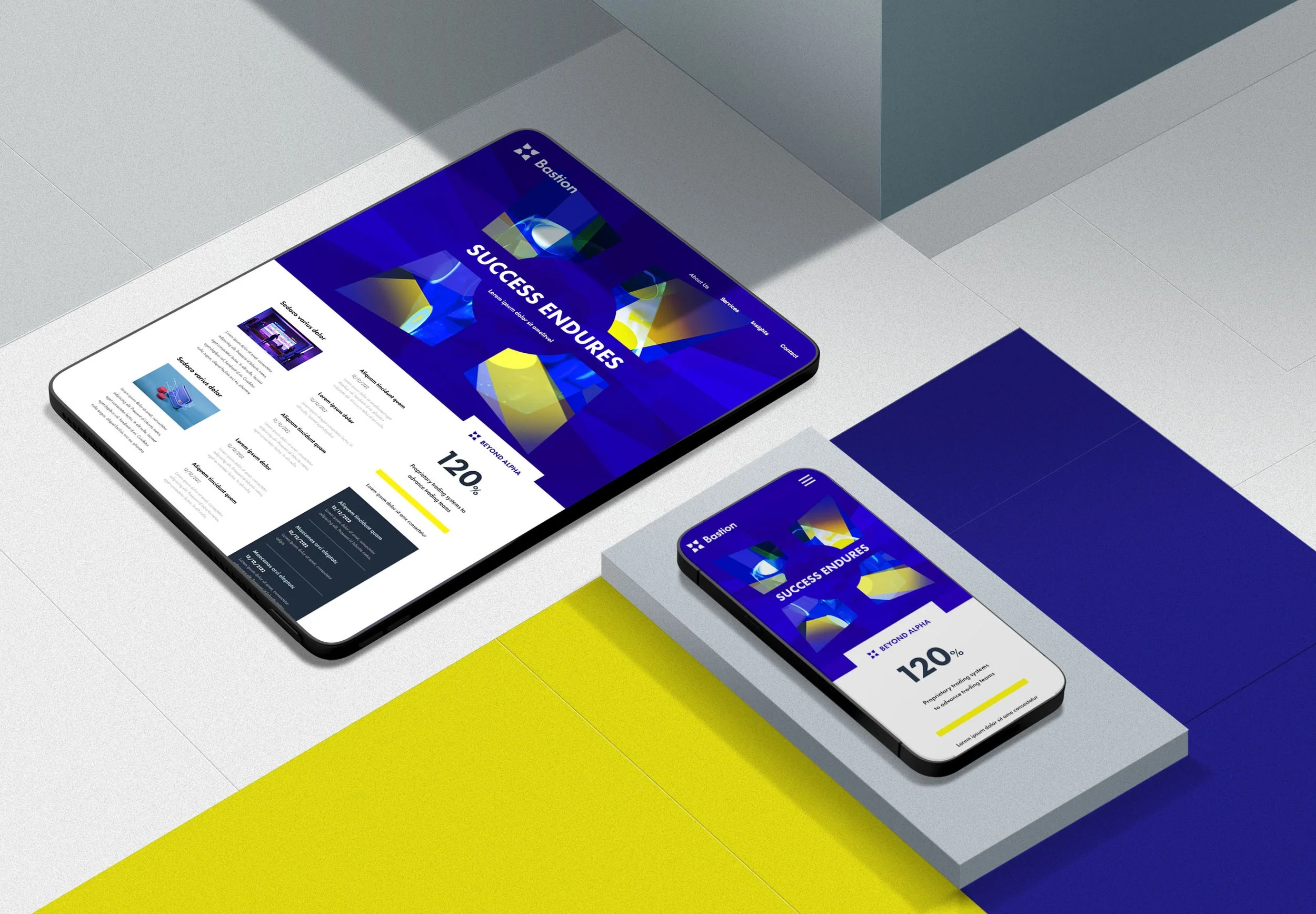
Visual Identity / Brand Applications / Brand Guidelines

Diamond Bastion
The logomark design is inspired by a diamond bastion fortification. The diamond bastion is a fortress design that possesses offensive and defensive capabilities without any dead zones. These four wings are symmetrically placed to protect the core, which symbolises crypto assets.


The visual identity embodies strength, security, and sophistication, reflecting our stability. Blue-violet conveys reliability, yellow brings hope, and our sans serif typography is contemporary and trustworthy. The sans serif typeface, based on geometrical shapes with clear legibility, further enhances this. Futuristic themes highlight our crypto innovation. The iconic logomark unifies all elements, reinforcing Bastion’s cohesive and enduring presence.