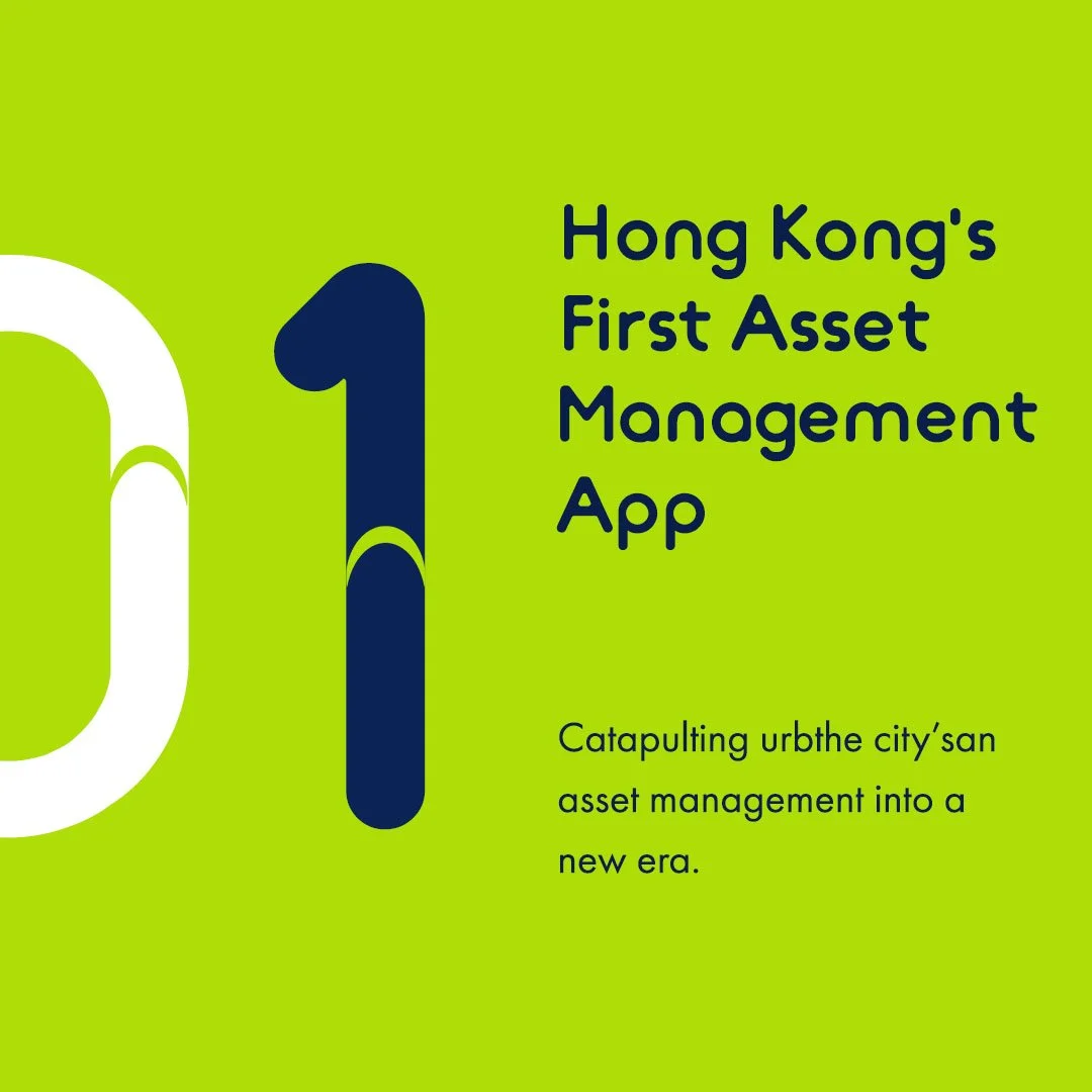
BamBoo
Branding design for Hong Kong's first smart asset management app - BamBoo. The BamBoo branding design integrates elements that symbolise growth, stability, and innovation.
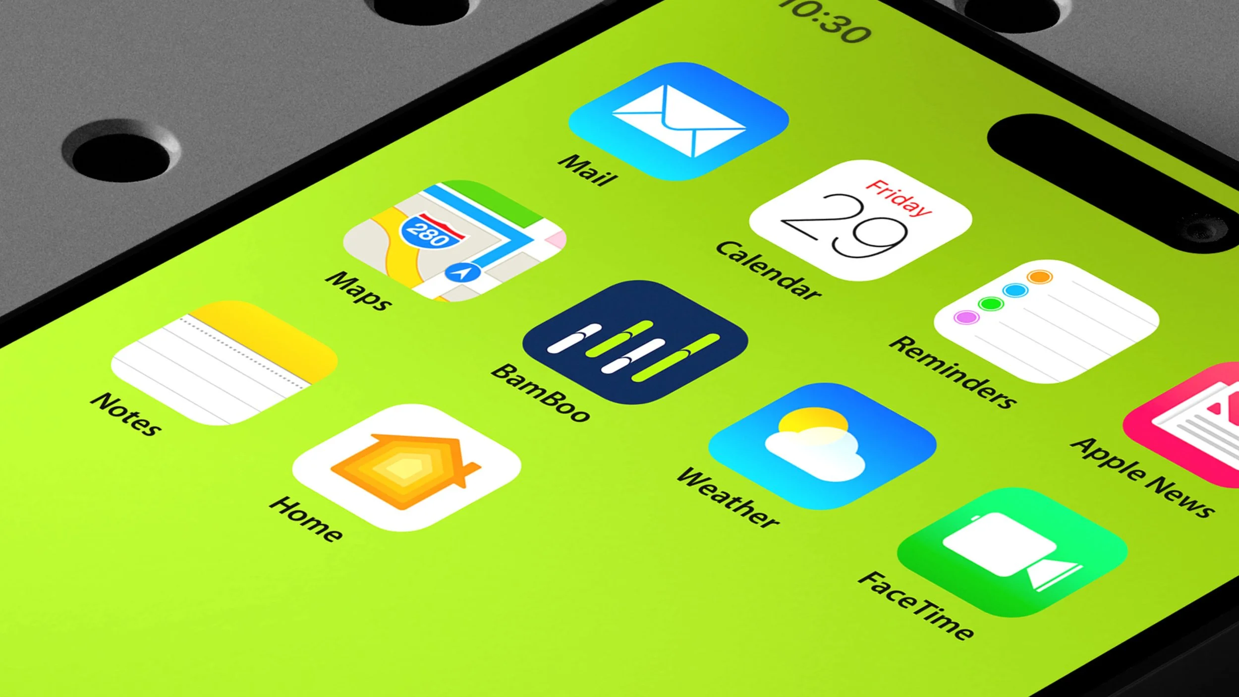
Visual Identity / Brand Applications


The logo features a simplified stock candlestick chart design, universally recognised in financial markets, combined with a touch of bamboo elements. This combination implies growth and stability while communicating universally in a contemporary way. Bamboo also represents Asian heritage. The strong use of bright blue-green and deep blue provides a stark visual contrast, signifying that the app stands out over the competition.
The BamBoo branding design combines financial symbolism with natural growth elements, creating a strong and memorable identity. Modern design principles appeal to a contemporary audience, conveying trust, growth, and innovation.